
Custom beauty packagingMade for your productPremium print and finishesServing U.S. brands
Custom beauty packaging
Skincare Packaging
Custom skincare packaging for serums, creams, moisturizers, cleansers, toners, oils, masks, sunscreen, and treatment products.
Explore products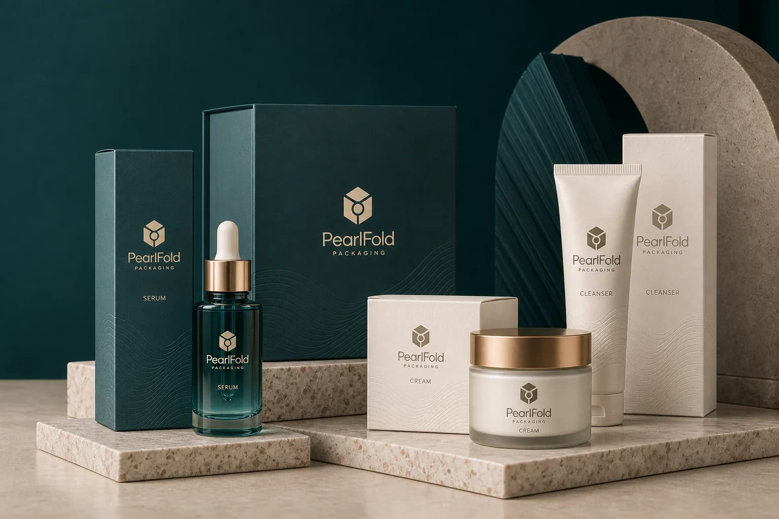
Explore product categories
Explore more product families
Compare related beauty and personal-care categories without leaving the PearlFold packaging catalog.
Shop the collection
Skincare Packaging products
Explore custom products within the skincare packaging collection.
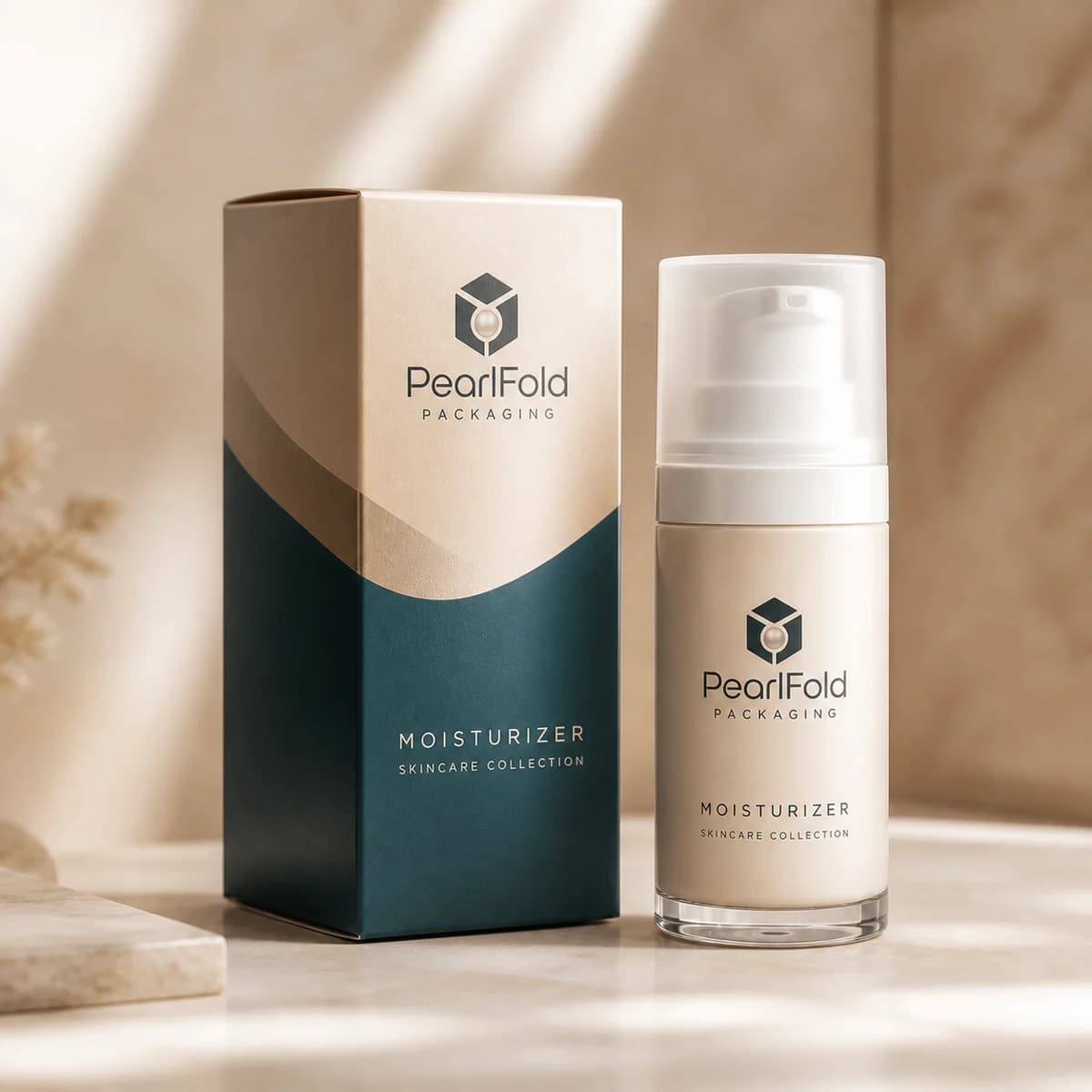
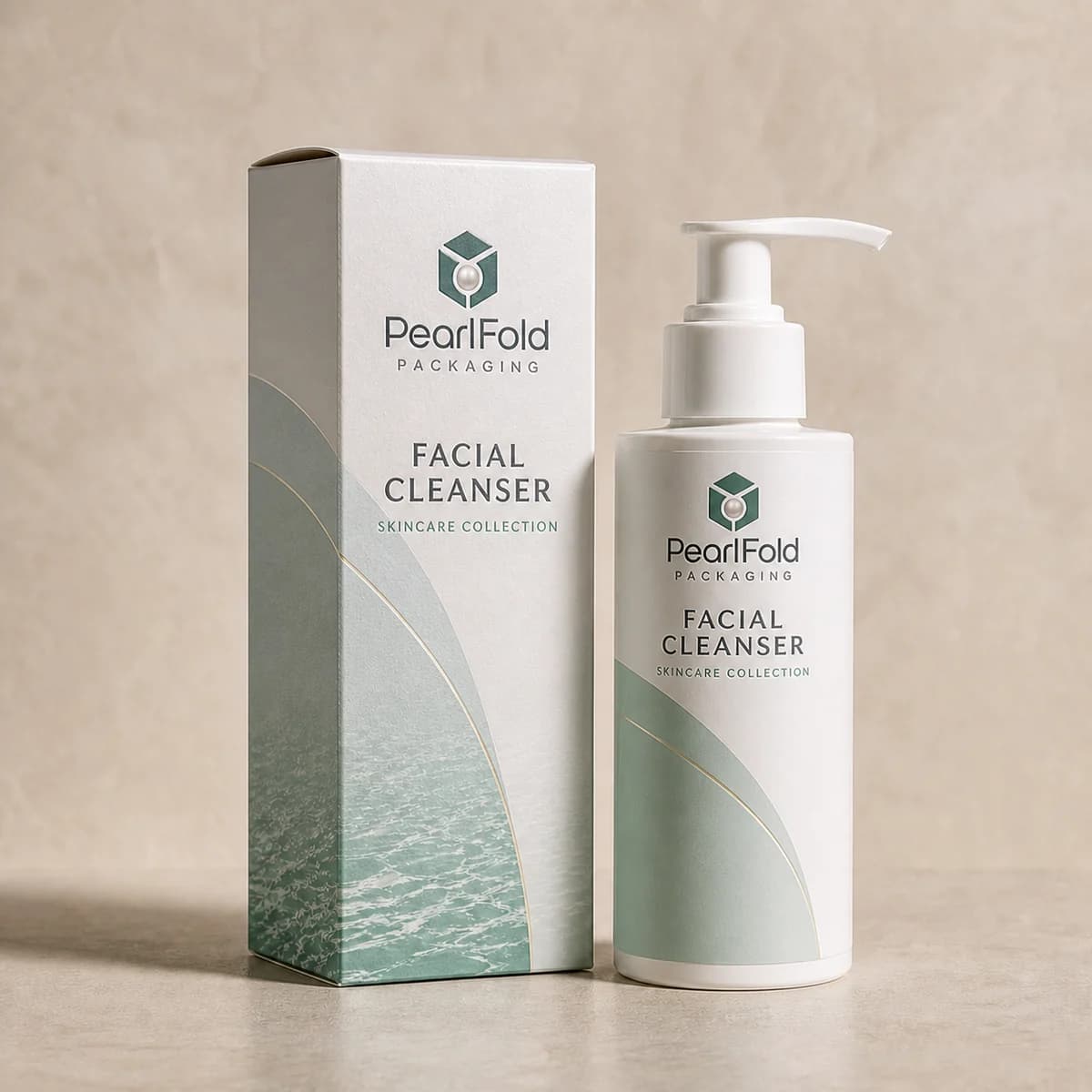
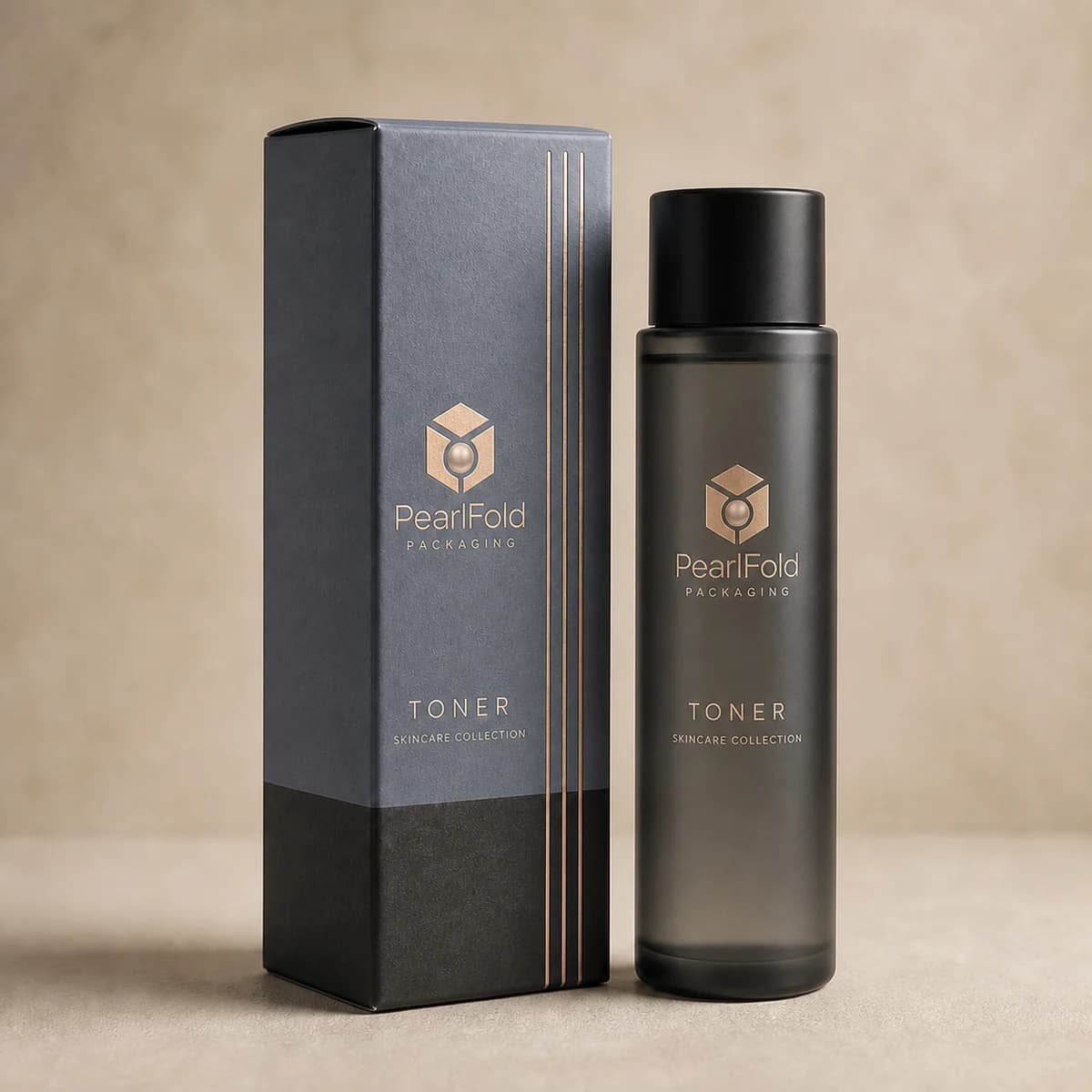
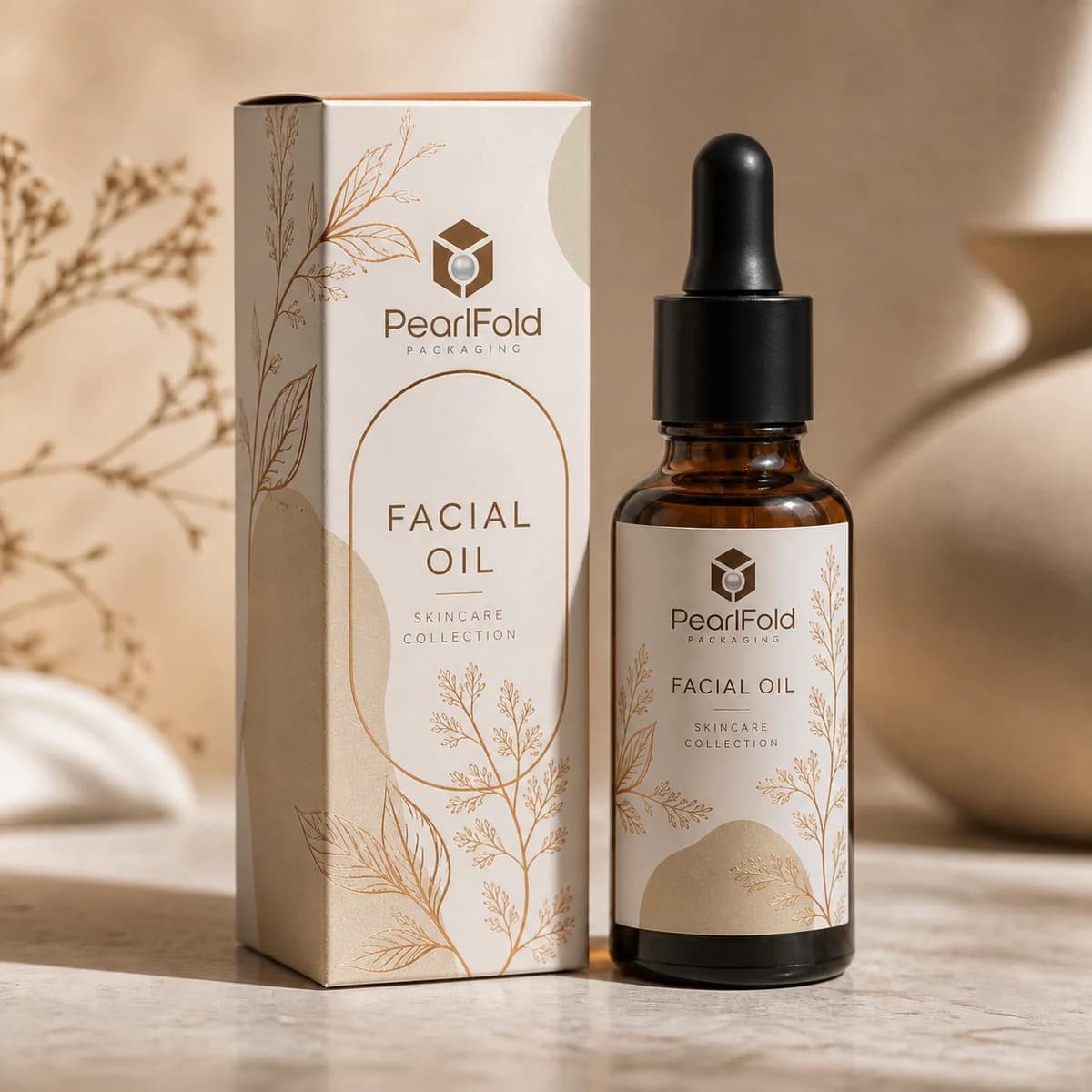
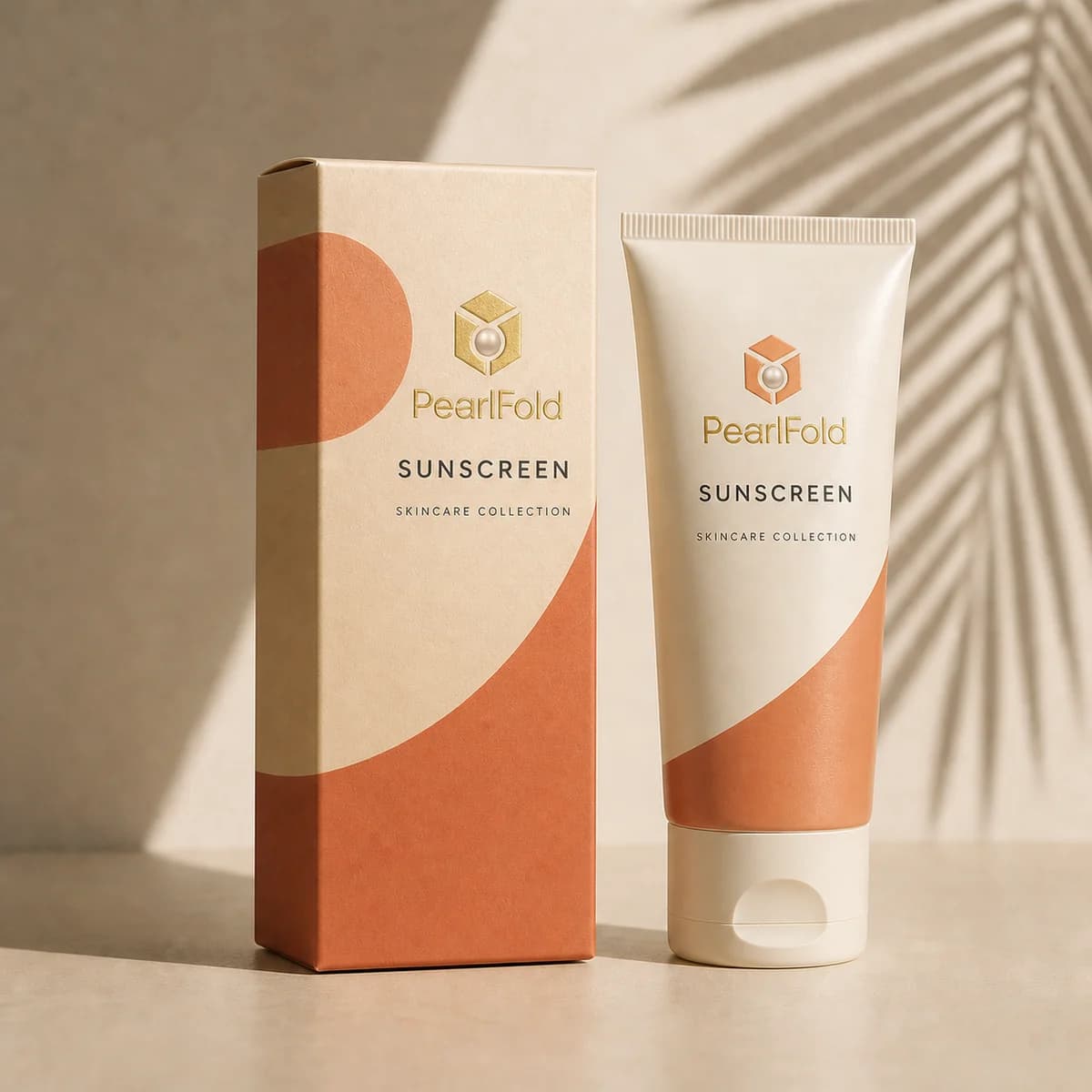
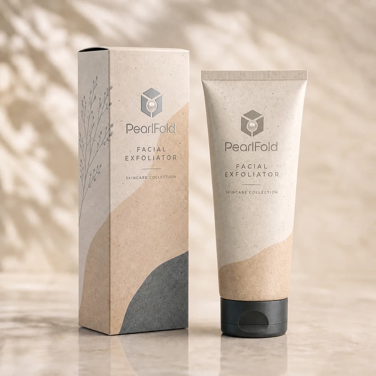
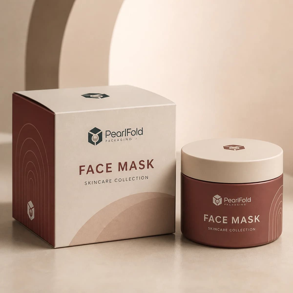
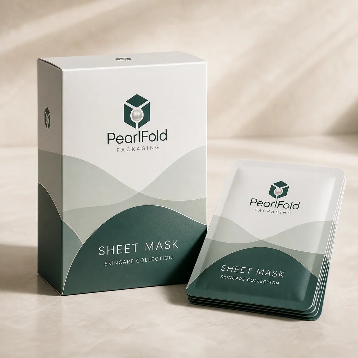
More products load as you scroll
Category buying guide
How to plan skincare packaging
What makes custom skincare packaging work well?
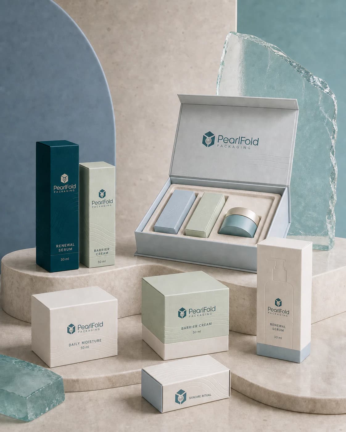
Skincare packaging has to do more than hold a container. It should organize a growing range, protect the presentation of each item, give required product information a clear place, and help the customer understand what belongs together. PearlFold develops custom skincare boxes for serums, creams, moisturizers, cleansers, toners, facial oils, masks, sunscreen, eye care, treatment products, and coordinated skincare sets. The most useful starting point is the product itself: its container format, dimensions, weight, closure, retail environment, and the experience the brand wants to create when the carton is opened.
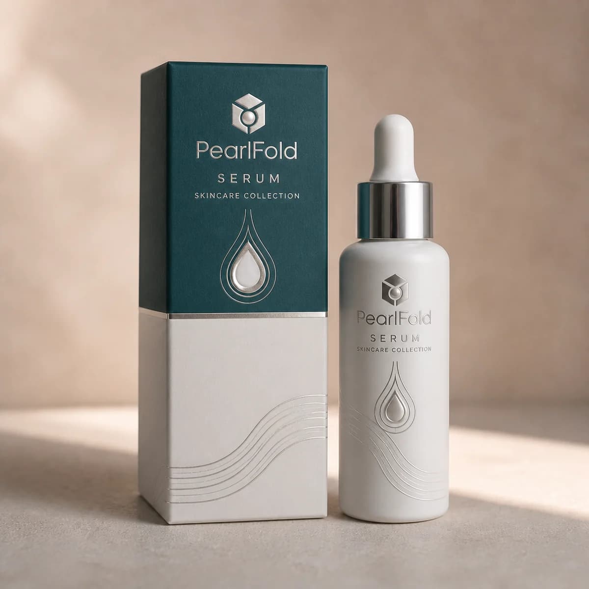
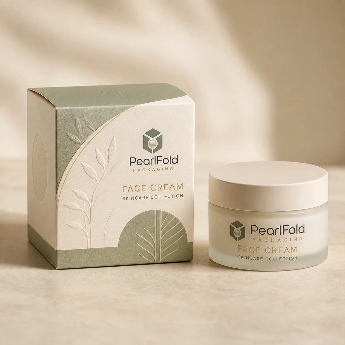
A serum dropper bottle, a wide cream jar, and a flexible cleanser tube do not need the same carton proportions or internal support. Even when the artwork belongs to one visual family, the structural brief should be considered item by item. That attention helps each package feel intentional rather than resized from a generic template. It also creates a more reliable foundation for typography, color, finishes, and any insert or presentation feature the range may require.
Choose a structure that matches the skincare format
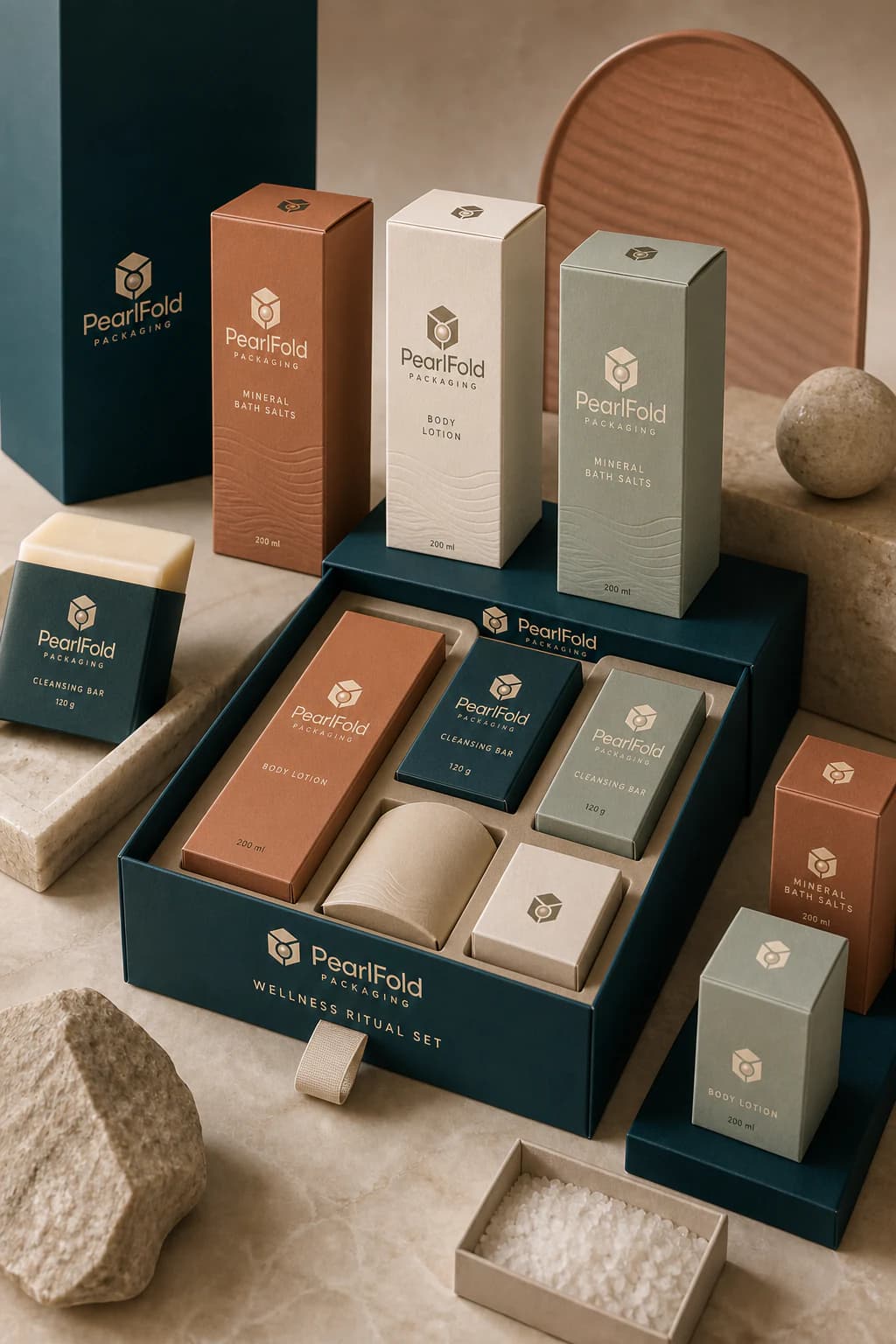
Folding cartons are a practical direction for many everyday skincare products because they provide broad printable surfaces and can be adapted to a wide range of bottle, tube, and jar formats. Rigid boxes, drawer boxes, and two-piece presentation boxes can support skincare sets, launch kits, gifts, or products that need a more substantial reveal. Sleeves can introduce an additional layer of branding or group related items without changing the primary carton.
The correct structure depends on more than appearance. A tall narrow bottle may need support that reduces movement, while a heavier jar may benefit from a different base and opening experience. Multi-product sets require a considered arrangement so the products read in the right order and remain visually balanced. PearlFold uses the approved product dimensions and packaging brief to focus the structural discussion on relevant options rather than forcing every product into the same box style.
Plan inserts and the unboxing sequence
An insert can help position a bottle, jar, applicator, or coordinated product set. Its purpose should be defined before artwork is finalized because the insert affects the outer dimensions, opening sequence, and amount of visible space around the product. Paperboard, rigid-board, or molded-paper directions may be considered according to the product, the chosen box structure, and the intended presentation. Exact material and construction recommendations remain part of the project specification rather than an assumed feature of every package.
For skincare sets, the reveal can guide the eye from a primary product to supporting items. For a single serum or cream, the objective may be a precise fit with a clean, uncomplicated opening. In both cases, the inside of the package should feel connected to the exterior. A coordinated color, repeated line motif, or restrained interior message can continue the brand experience without crowding the product.
Build a visual system across the range
Skincare collections often contain several products with similar containers and related names. A clear information hierarchy helps customers distinguish a serum from an eye serum, a cleanser from an exfoliator, or a moisturizer from a face cream while still recognizing the collection. Brand name, product type, variant, and essential supporting information should have deliberate positions and a consistent reading order.
Consistency does not mean every carton must look identical. Color families, proportion changes, tactile finishes, and carefully controlled illustration or pattern can separate product groups while preserving the same design logic. A flexible system is especially useful when the range may expand. New products can then enter an established hierarchy instead of requiring the brand to redesign the entire shelf presence.
Use print and finish choices with purpose
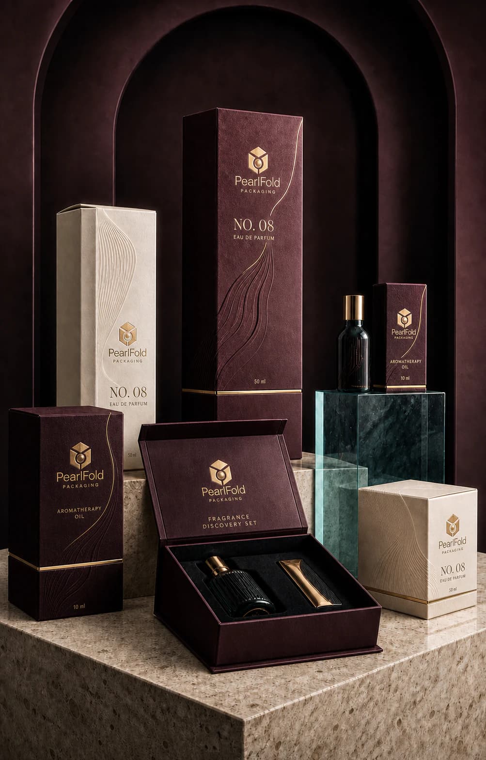
Paper surface, ink coverage, foil placement, embossing, debossing, and selective gloss can influence how skincare packaging feels before the customer reads a word. These choices work best when they support the hierarchy. A small foil detail can direct attention to the brand or product name; embossing can add tactility to a restrained mark; a soft surface can make a minimal carton feel more considered. Applying every available finish at once usually weakens that focus.
Artwork should also account for practical production details such as folds, seams, opening panels, and the relationship between front, side, and back copy. PearlFold treats the structural dieline and the graphic layout as connected parts of the same package. Final print and finish decisions are confirmed against the approved material, artwork, and project specification rather than presented as universal claims.
Organize information for real skincare buying decisions
The front panel should make the product type and brand easy to identify. Supporting panels can then organize the approved product information in a readable sequence. The amount and type of content vary by product and market, so brands should supply their finalized copy and review any applicable requirements with their own qualified advisers. PearlFold does not invent ingredients, performance claims, certifications, or compliance language.
Good hierarchy benefits both a retail shelf and an online product image. Strong product naming, controlled line lengths, and clear contrast help the carton remain understandable when it is photographed at a smaller size. This is particularly important for collections sold through a mixture of direct-to-consumer, retail, professional, and gifting channels.
Explore skincare packaging by product
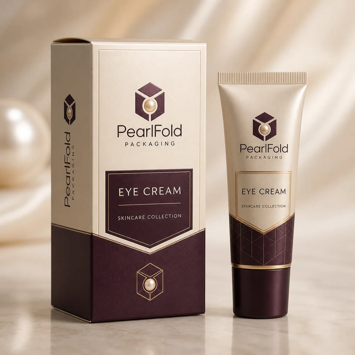
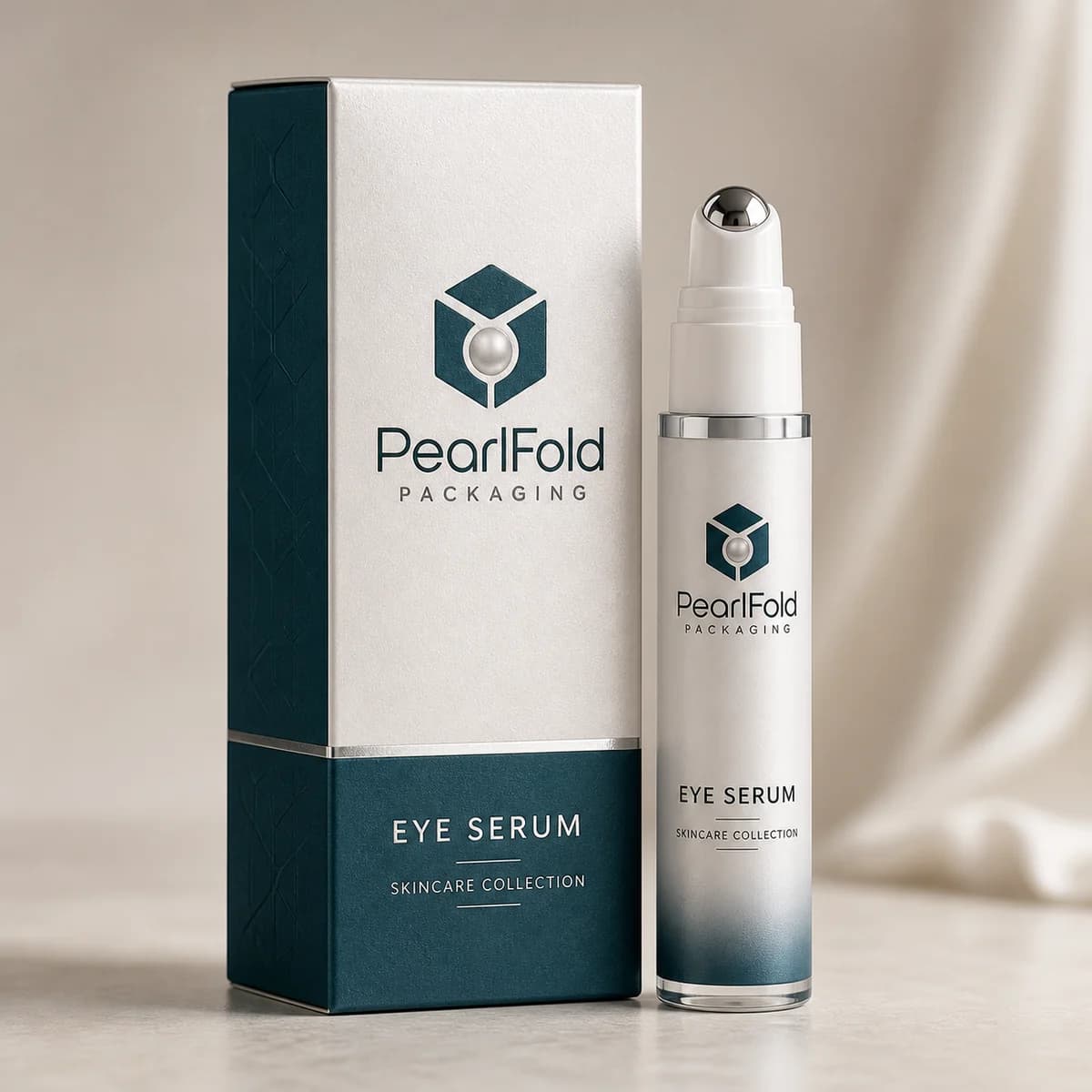
The PearlFold skincare collection includes custom serum boxes, face cream boxes, moisturizer boxes, facial cleanser boxes, toner boxes, facial oil boxes, sunscreen boxes, facial exfoliator boxes, face mask boxes, sheet mask boxes, eye cream boxes, eye serum boxes, acne treatment boxes, and skincare set boxes. Each product page focuses the conversation on the relevant format while keeping shared structural, material, and finishing possibilities connected across the category.
If several products are being developed together, reviewing them as one packaging family can reveal useful efficiencies in proportions, hierarchy, artwork preparation, and presentation. If the project begins with one item, the same system can still be planned with future additions in mind. The goal is not to predict every later SKU, but to avoid choices that make the next product unnecessarily difficult to integrate.
Which box style suits each skincare product?
| Skincare format | Useful starting structure | What to confirm |
|---|---|---|
| Serum or facial oil | Proportioned folding carton or supported presentation box | Bottle height, dropper clearance, base diameter, and movement control |
| Cream or moisturizer jar | Folding carton, two-piece box, or rigid set box | Jar weight, lid width, opening direction, and base support |
| Cleanser or sunscreen tube | Folding carton or sleeve format | Tube profile, cap position, panel depth, and shelf requirements |
| Skincare set | Rigid box, drawer box, or presentation box with inserts | Product order, insert layout, removal points, and refill plans |
This table is a planning guide, not a fixed specification. Custom skincare boxes should be confirmed against the actual container and approved artwork. A physical sample or accurate container drawing can prevent avoidable changes later in the project.
What should a skincare brand decide before requesting a quote?
A useful request identifies the exact product, container dimensions, likely quantity, preferred opening style, artwork status, and target presentation. If the brand is comparing custom printed skincare boxes, kraft skincare boxes, luxury skincare boxes, or skincare boxes with inserts, the brief should explain why each direction is under consideration. That context helps separate a structural need from a surface preference.
Brands should also identify which details are fixed and which are open to recommendation. A confirmed bottle and final copy create a different starting point from an early concept with no approved container. Clear inputs allow PearlFold to discuss relevant structures and finishing directions without inventing technical details or product claims.
Can one packaging system support a full skincare line?
One packaging system can support a full skincare line when it is built around repeatable rules rather than one rigid carton. Shared grid positions, naming hierarchy, paper direction, and finish placement can connect custom serum boxes, moisturizer boxes, sunscreen boxes, and eye cream boxes. Dimensions can change where the containers require it. The customer still recognizes one brand family because the visual decisions remain controlled.
Prepare a useful skincare packaging brief
A productive quotation request begins with the product type, container dimensions, expected box style, artwork status, approximate order requirement, and any presentation priorities. Reference photographs, container drawings, or an existing package can help clarify the intended fit. For a set, include the number of products and the desired arrangement. If materials or finishes are still open, describe the visual and tactile direction instead of guessing at a technical specification.
PearlFold can then organize the discussion around the details that materially shape the package. The resulting direction should feel specific to the product, coherent with the wider range, and ready for the next stage of structural and artwork review. Explore the products above, compare the formats relevant to your line, and use the custom quote request when you are ready to discuss a skincare packaging project.