

Principle
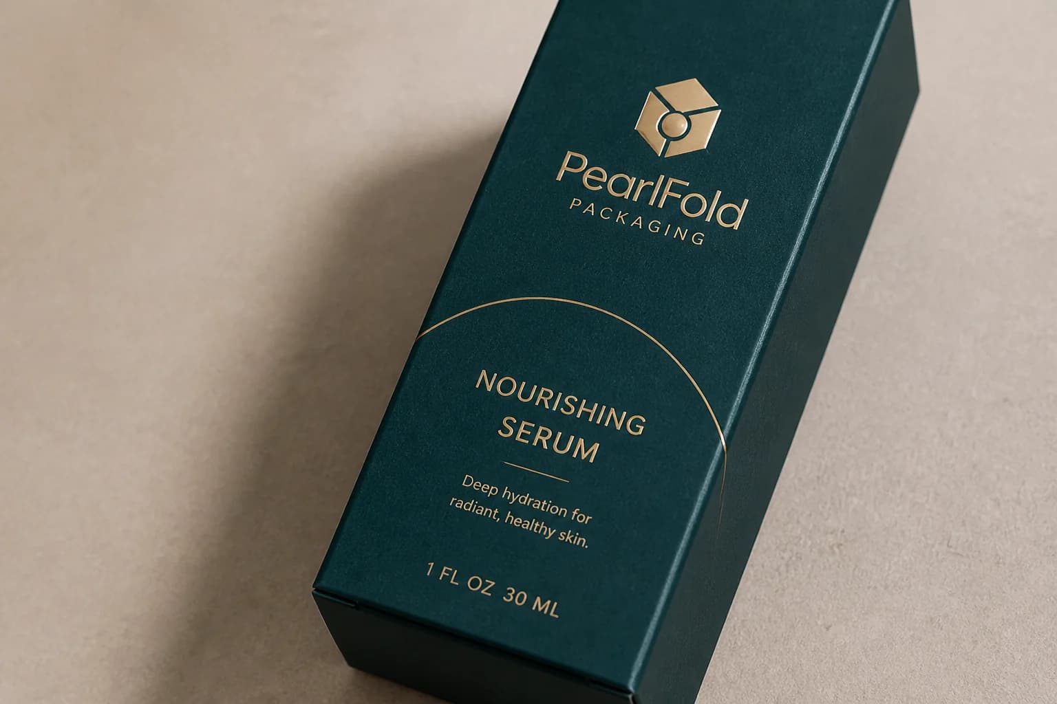
Make the front panel do one clear job
Give the most important information the strongest position, then move supporting detail to the panels designed to carry it.
What to prioritize
- Brand name and mark
- Product name and variant
- One useful permitted product detail
- Net contents where required
What to move elsewhere
- Directions and cautions
- Ingredients or customer-supplied legal copy
- Certifications and symbols
- Extended brand storytelling
Principle
Let the structure shape the artwork
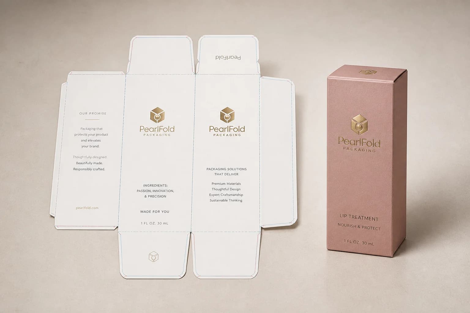
Build final artwork on the approved size-specific dieline so the design respects every panel, fold, glue area and opening sequence.
Cut line
Where the finished package is trimmed.
Fold line
Where the board folds and artwork changes plane.
Bleed
Artwork extended past the intended cut edge.
Safe area
Space that protects critical content from edges and folds.
Principle
Build rules the whole range can use
A product-family system makes each SKU easier to recognize while preserving one controlled brand language across different formats.
Repeat
Logo position, typography and core panel logic.
Vary
Product names, approved color cues and selected imagery.
Protect
Reading order, contrast and essential information.

Principle
Design for the material and print process
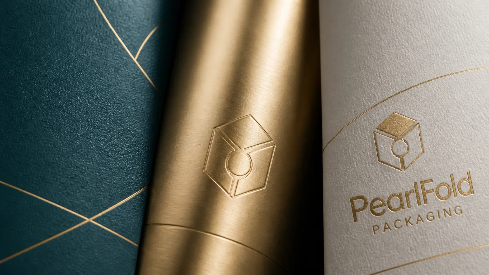
Material and finishing choices can change contrast, color and tactility. The artwork should anticipate those changes before the final proof.
- Use foil, embossing or debossing to support a clear priority.
- Review how coated and uncoated surfaces affect color.
- Keep small type and fine detail realistic for the chosen process.
- Confirm special effects on clearly named artwork layers.
Principle
Review every panel before handoff
Use this packaging artwork checklist before files move into preflight or proofing.