
Custom beauty packagingMade for your productPremium print and finishesServing U.S. brands
Custom beauty packaging
Bath & Body Packaging
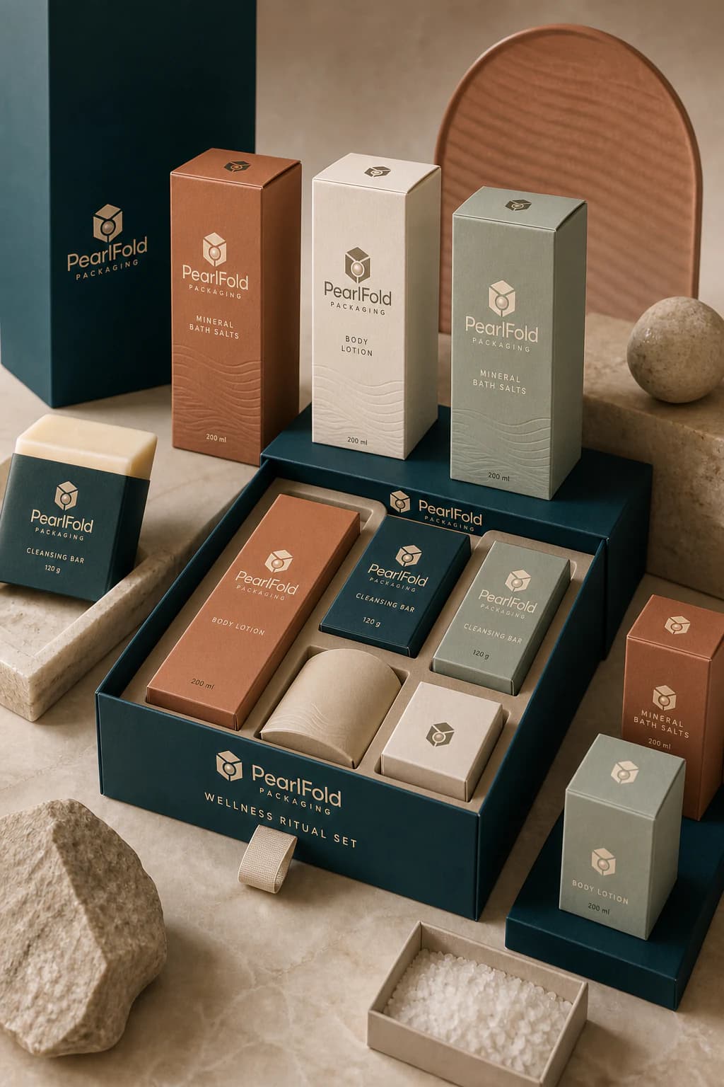
Custom bath and body packaging for soap, lotion, body butter, bath bombs, salts, deodorant, hand care, massage oil, body wash, shower gel, and coordinated gift sets.
Explore products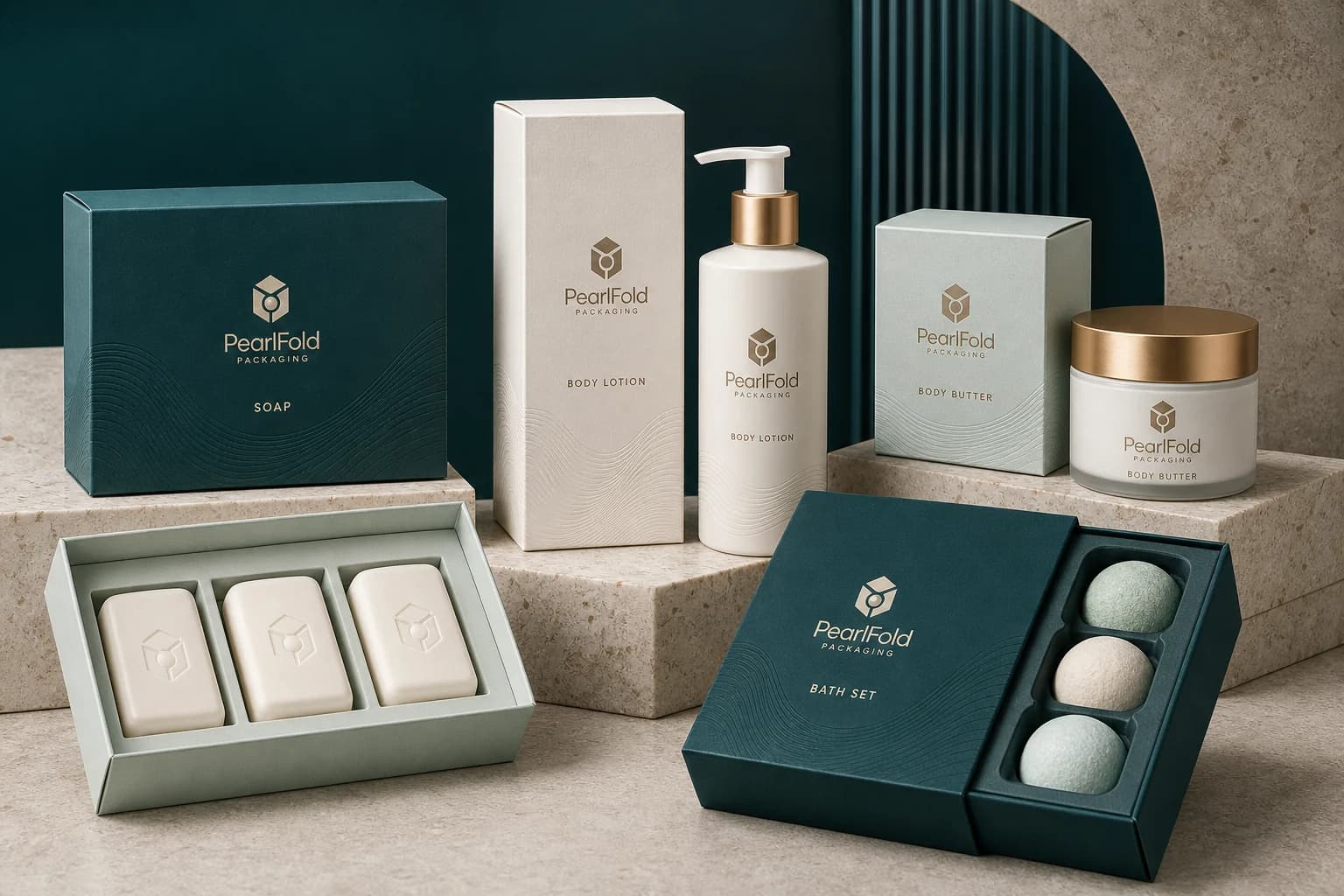
Explore product categories
Explore more product families
Compare related beauty and personal-care categories without leaving the PearlFold packaging catalog.
Shop the collection
Bath & Body Packaging products
Explore custom products within the bath & body packaging collection.
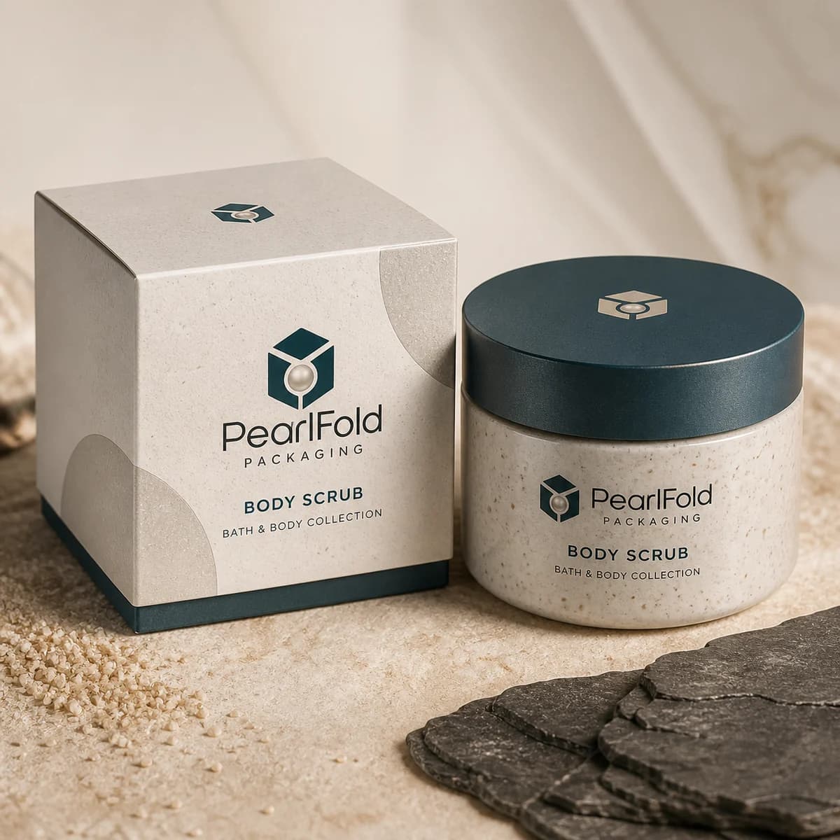
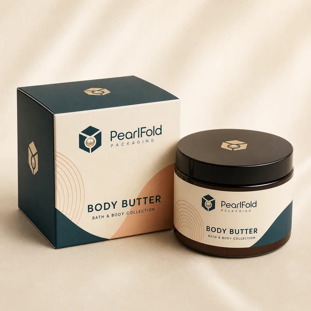
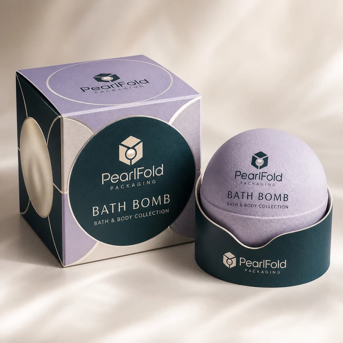
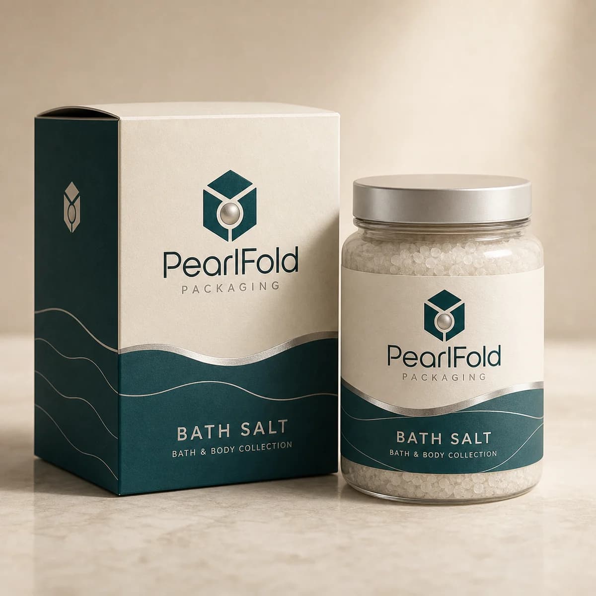
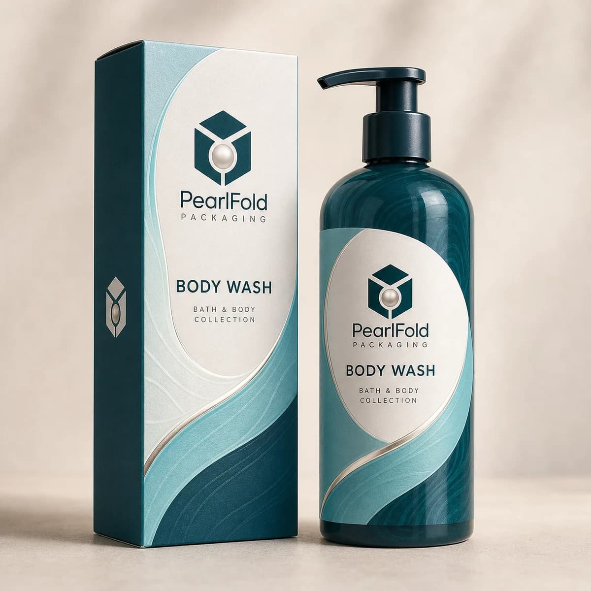
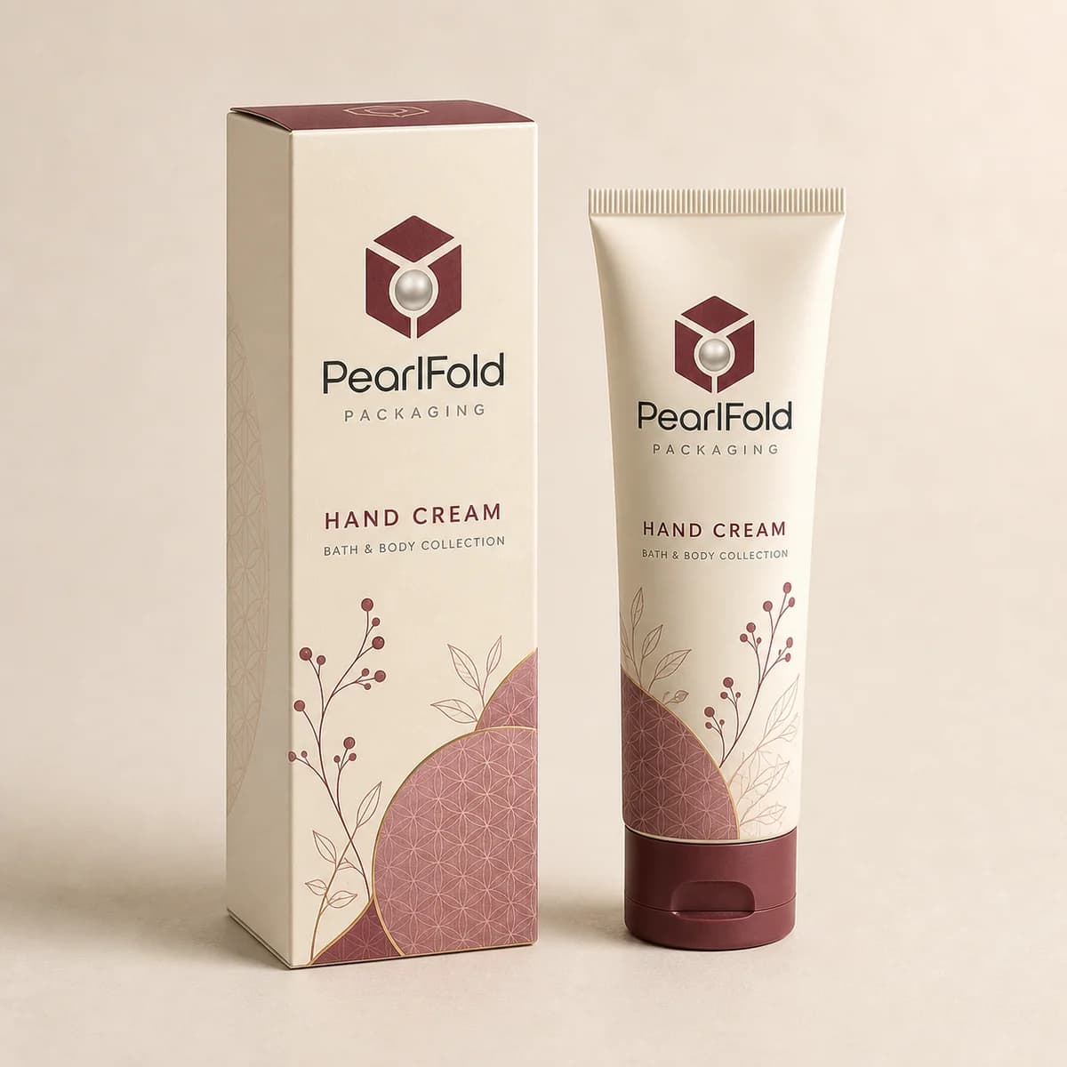
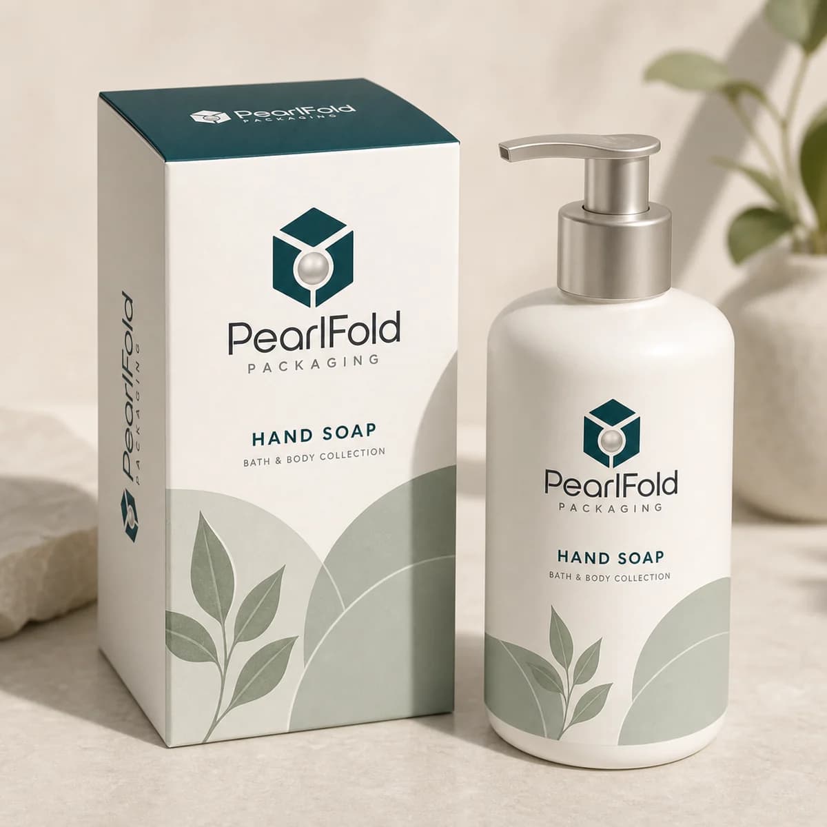
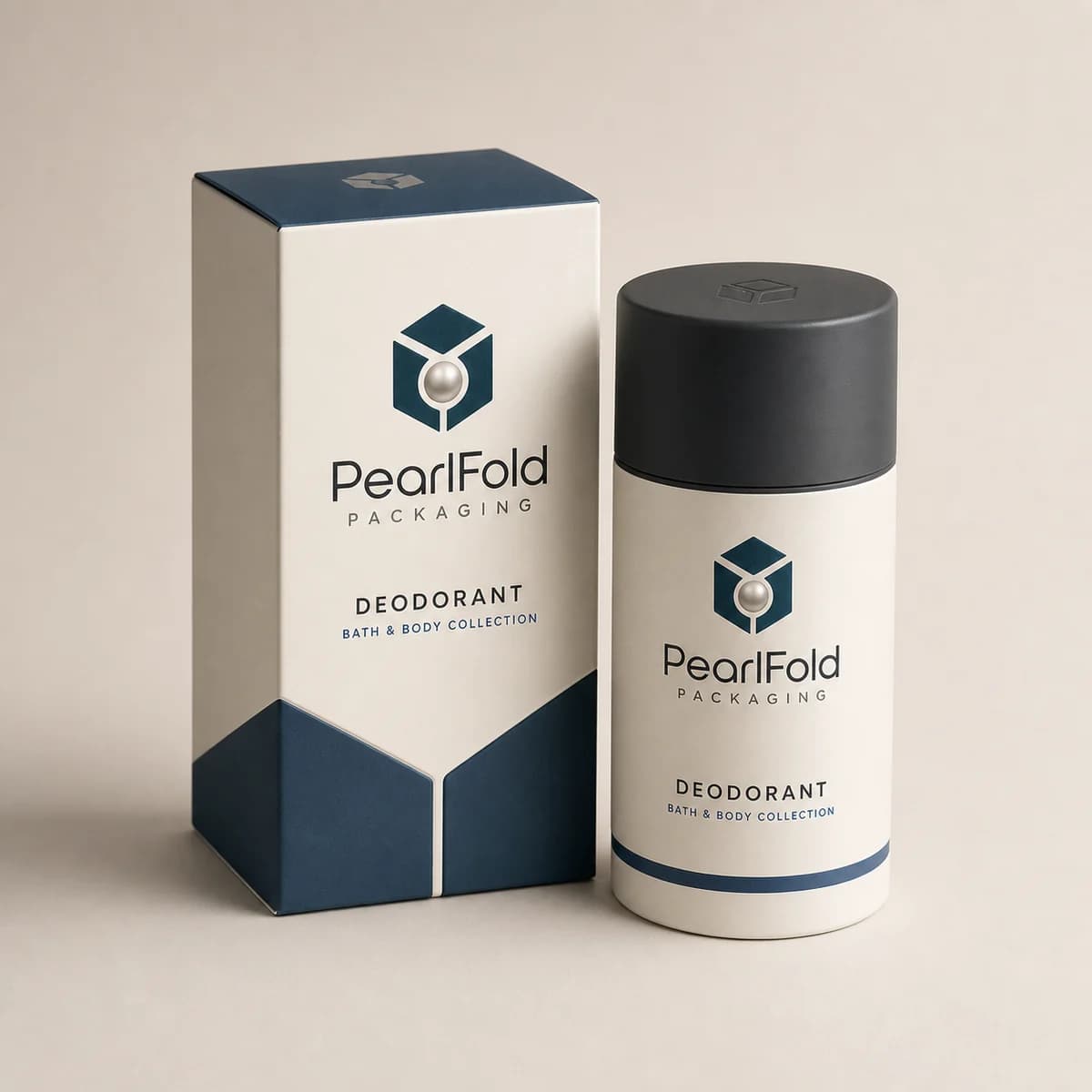
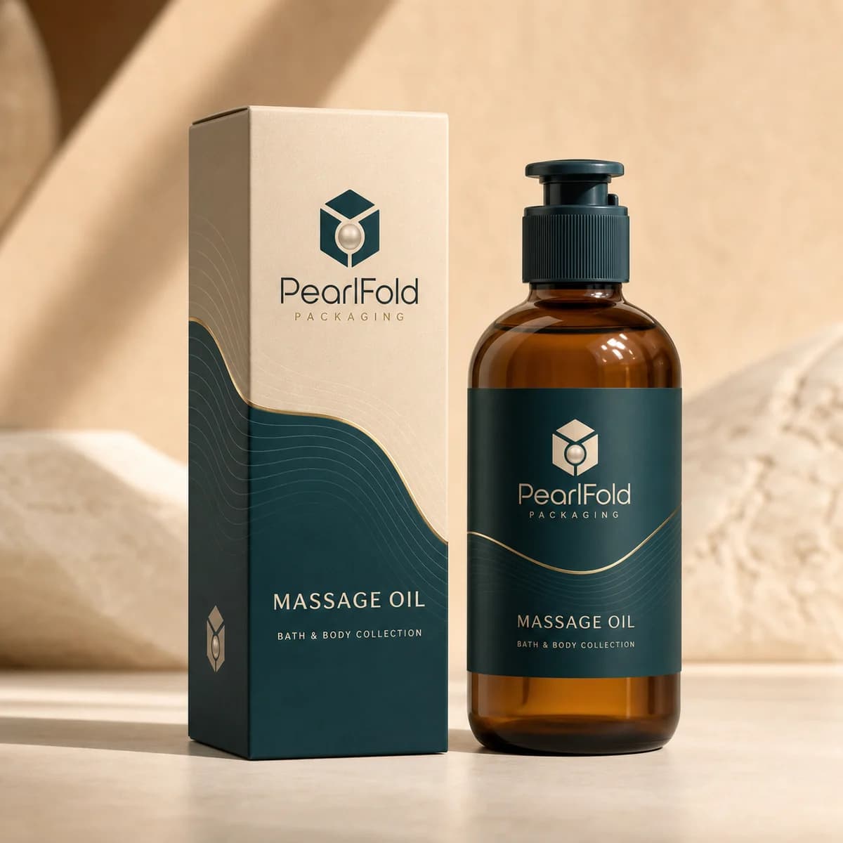
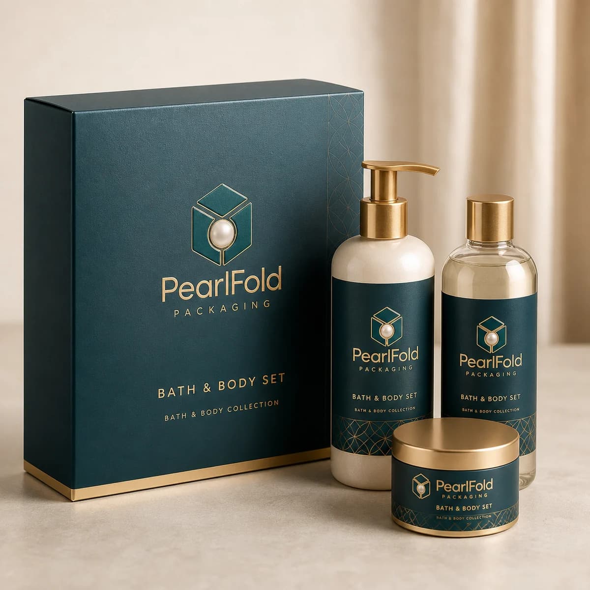
All 12 products are visible
Category buying guide
How to plan bath & body packaging
How should bath and body packaging be planned?
Bath and body collections bring together many product shapes: wrapped or molded soap, pump bottles, squeeze tubes, jars, bath bombs, salts, scrubs, and coordinated sets. Custom packaging should make those formats easy to recognize while giving the complete range a consistent shelf and unboxing presence. PearlFold develops bath and body boxes around the product dimensions, container type, chosen structure, approved artwork, and the experience the brand wants to create.
The category can move between practical daily-care packaging and more elaborate gifting, so the structural brief matters. A single soap carton has different needs from a bath-bomb set or a group of lotion and body-butter products. Starting with the product helps define the useful space, opening style, and information hierarchy before materials or finishes are selected.
Match the structure to the bath or body product
Folding cartons are relevant to soaps, hand creams, lotions, body washes, scrubs, and many individual products. Sleeves and wraps can provide a different presentation when appropriate to the format. Rigid boxes, drawer boxes, two-piece boxes, and fitted set structures can organize multiple products or support a gift-focused reveal. The correct direction depends on the approved product and packaging specification.
Container geometry should guide the dieline. A pump bottle needs appropriate height and headroom, a jar needs a stable base, and a bath-bomb set needs an interior arrangement that keeps several items visually ordered. Product measurements and intended orientation should be confirmed before artwork is finalized.
Design sets as one coordinated experience
Bath and body products are often grouped into routines or gifts. A set can pair soap with lotion, combine bath bombs and salts, or organize body scrub and body butter as complementary products. The interior should make that relationship clear without feeling crowded. A primary product can lead the arrangement, or equal items can be placed in a simple rhythm.
Outer and inner artwork should share the same visual language. Repeated color, pattern, typography, or material can connect the set even when the individual containers differ. The insert should be planned early because it affects outer dimensions and the amount of space available for the reveal.
Create a flexible identity across the range
Soap, lotion, hand cream, body wash, body butter, bath salts, and scrubs need clear product-type labels. A consistent hierarchy helps customers identify the item quickly and understand how it belongs to the brand. Variant colors or illustrations can separate scents or product families, but naming and layout should remain strong enough to work without color alone.
A scalable system makes future additions easier to integrate. It can establish fixed positions for the brand, product type, variant, and supporting copy while allowing the carton proportion and visual emphasis to change by format. This gives new products room to feel specific without disconnecting from the collection.
Use tactile details with restraint
Bath and body packaging can feel premium through the surface itself. Tactile paper, controlled embossing, debossing, foil detail, or selective gloss can emphasize the brand or a small visual motif. The finish should support the intended mood and remain legible at actual package size. Decoration that competes with the product name or approved information weakens the hierarchy.
Material and finish decisions also interact with ink coverage, folds, seams, and opening panels. PearlFold evaluates them as part of the package system. Final specifications are confirmed for the individual project; no material, finish, certification, or sustainability claim is assumed for every bath and body box.
Give approved product information a readable place
The front panel can lead with the brand and product type, while side and back panels organize the brand’s finalized content. Exact information requirements depend on the product and market. Brands should supply approved copy and obtain any professional review they need. PearlFold does not invent ingredients, therapeutic benefits, performance claims, certifications, or compliance language.
Readable hierarchy also improves online merchandising. When a carton is shown as a small product image, the essential identity should remain recognizable. Strong contrast, controlled line lengths, and concise product naming help the physical package translate into digital shopping environments.
Explore bath and body packaging formats
The category includes custom soap boxes, body lotion boxes, body scrub boxes, body butter boxes, bath-bomb boxes, bath-salt boxes, body-wash and shower-gel boxes, and hand-cream boxes, with additional related products able to join the same archive as the catalog grows. Each product page gives the buyer a focused route into the packaging discussion.
When a project includes several products, reviewing them together can align proportions, color systems, label hierarchy, and gift-set possibilities. When one product launches first, the same principles can establish a foundation for the next item. This balance between consistency and format-specific structure is central to a coherent bath and body range.
Which box style works for common bath and body products?
| Bath or body product | Useful starting structure | What to verify |
|---|---|---|
| Bar soap | Folding carton, sleeve, or window carton | Bar dimensions, surface protection, opening style, and copy area |
| Bath bomb or bath salts | Folding carton, supported set box, or presentation carton | Product shape, containment, fragrance separation, and movement |
| Body lotion, wash, or scrub | Proportioned folding carton or gift-set structure | Bottle or jar weight, closure position, and base support |
| Coordinated body-care set | Rigid box, drawer box, or two-piece presentation box | Arrangement, insert access, product order, and gift presentation |
Custom soap boxes and bath product boxes should begin with the real item and its selling context. A sleeve may suit a simple bar presentation, while a gift-ready collection may need an insert and a more deliberate reveal. The choice should be explained by product fit and customer use, not by a generic idea of what looks expensive.
How can bath and body packaging support a growing range?
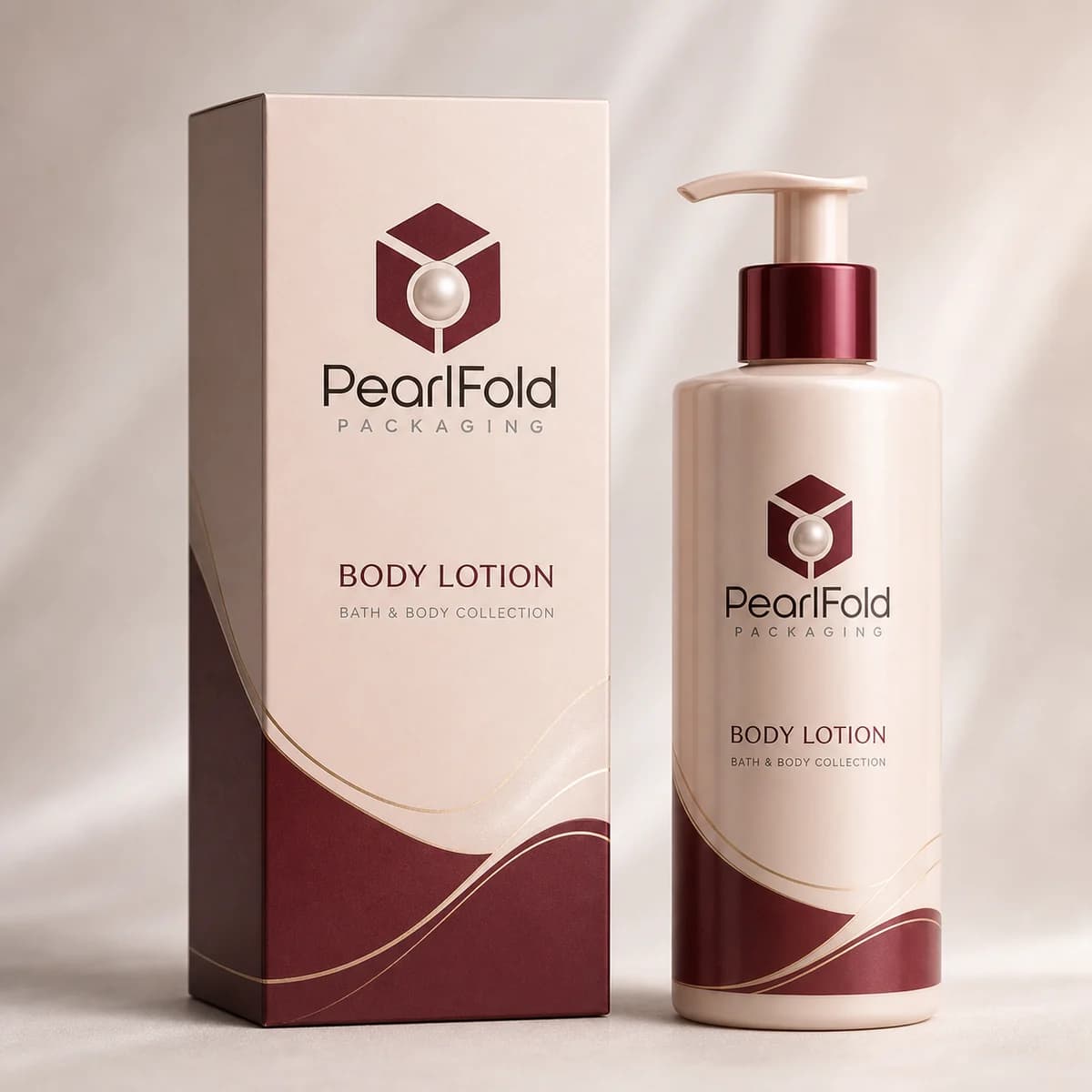
A repeatable layout helps body lotion boxes, body scrub boxes, bath salt boxes, body butter boxes, and soap boxes feel connected. Product names should remain easy to identify even when fragrances or formulas change. A shared typographic grid can carry the main brand, while color, pattern, or a controlled image system can distinguish variants.
Custom bath and body packaging also needs enough flexibility for different container shapes. The exterior proportions may change, but logo position, product hierarchy, finish placement, and tone of voice can remain consistent. This approach protects brand recognition without forcing every product into the wrong carton.
What details should a bath and body quote request include?
Provide the exact product type, container or bar dimensions, approximate quantity, desired box style, artwork status, and any insert, sleeve, or window requirement. Explain whether the package is for retail, direct shipment, gifting, or a coordinated set. For multiple scents or formulas, identify how many artwork variants are expected. PearlFold can then focus the discussion on relevant structures and print directions without assuming product claims or technical requirements.
Prepare a bath and body packaging brief
Start with the product type, container or product dimensions, weight where relevant, desired box style, artwork status, approximate order requirement, and intended retail or gifting use. For sets, include every item and the preferred arrangement. If materials or finishes remain open, describe the desired feel and which design elements should receive emphasis.
It is also helpful to identify whether the package belongs to an existing range or establishes a new visual system. Existing brand guidelines, current labels, product photography, and examples of the intended shelf relationship can clarify what should remain consistent. For a new range, prioritizing the first few product formats helps define a system with enough flexibility for future variants without creating rules that are too broad to be useful.
Packaging decisions should be reviewed as a sequence. Confirm the product and structure first, then the fit and opening experience, followed by artwork hierarchy, materials, and finishing detail. This order reduces avoidable conflicts and keeps the discussion focused on choices that improve the real package rather than decoration considered in isolation.
PearlFold can then focus the discussion on practical structural and visual directions. Browse the available products above, compare the formats that match your range, and request a custom quote when the core specifications and presentation priorities are ready.