
Texture, color and caliper establish the foundation.
Custom beauty packagingMade for your productPremium print and finishesServing U.S. brands
Packaging printing & finishes
Print with clarity.
Finish with purpose.
Printing methods and decorative finishes define how packaging looks, feels and communicates. This guide helps beauty and personal-care brands make confident choices that align with the approved material, structure, artwork and production plan.
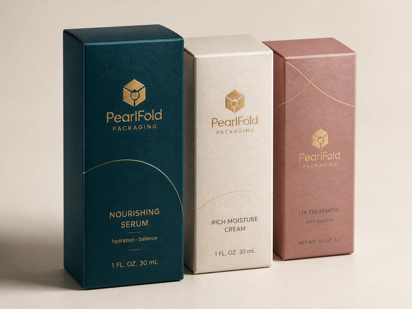
Finish anatomy
Every element has a role.
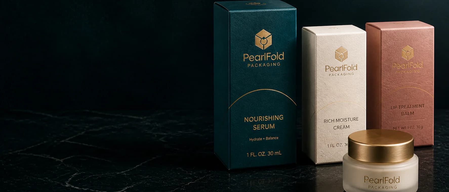
A coordinated system of material, printing and finishing creates hierarchy, texture and contrast without asking every effect to compete.
Solid fields and fine detail create contrast and depth.
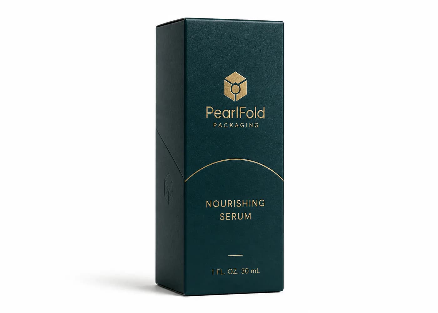
Metallic detail brings controlled emphasis to selected elements.
Raised or recessed relief creates tactile hierarchy.
Gloss contrast adds dimension over a lower-sheen surface.
Printing methods: how they compare
Compare packaging printing methods
Each process has distinct strengths. The relevant direction depends on the approved artwork, substrate, finish plan and production requirements.
| Decision point | Offset lithography | Digital printing | Flexographic printing | Screen printing |
|---|---|---|---|---|
| Useful for | Detailed cartons with controlled color and refined graphics | Shorter runs, prototypes and artwork with frequent variation | Selected packaging formats with graphic solids and repeat work | Bold specialty graphics, opaque color and tactile ink effects |
| Visual character | Crisp type, fine detail and consistent broad ink coverage | Clean reproduction with flexible version management | Direct, bold coverage suited to process-compatible artwork | Distinct deposits and strong graphic presence |
| Surface direction | Common coated and uncoated paperboard directions | Depends on the approved digital-compatible stock | Process-compatible paper, film or label constructions | Selected rigid, coated or specialty surfaces |
| Strengths | Useful for established artwork and larger coordinated ranges | Supports agile testing and multiple artwork versions | Practical for repeat graphics on suitable applications | Creates focused emphasis on suitable packaging components |
| What to confirm | Color references, stock and finish plan should be confirmed together | Color and finish availability must be reviewed for the selected process | Fine detail and tonal work require process-specific review | Artwork, registration and production sequence need confirmation |
Finish library
Use finish to guide attention and touch.
Decorative and protective directions work best when each has a clear job within the design.
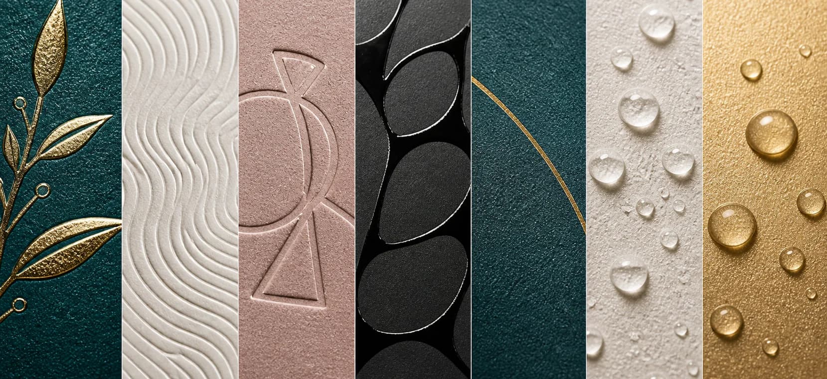
Foil stamping
Metallic emphasis for a mark, line or focal detail.
Embossing
Raised relief that adds controlled tactile hierarchy.
Debossing
Recessed depth for a quieter, refined surface detail.
Spot UV
Selective gloss that creates contrast over a matte field.
Soft-touch / matte
A low-sheen surface with a smooth tactile character.
Protective coating
A project-specific coating selected for the approved surface.
Metallic / pearlescent
Reflective character through approved inks or materials.
Print method or finish?
Different tools.
Different results.
Print method defines how the image is placed.
- Line sharpness and detail
- Color system and repeatability
- Coverage and opacity
- Compatibility with the approved stock
Decorative finish defines how the surface responds.
- Texture and tactile feel
- Light reflection and contrast
- Perceived emphasis and differentiation
- Interaction with the approved artwork
Production workflow
Define. Test. Review. Approve.
A disciplined review path connects creative intent to the controlling production reference.
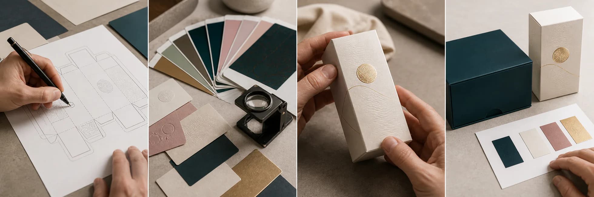
Define
Align the approved artwork, material, print method and finish priorities.
Test
Review the relevant color, stock, texture and finish references.
Review
Evaluate proof or sample details against the agreed specification.
Approve
Confirm the controlling proof or sample before final production.
Artwork readiness checklist
Prepare finish instructions that production can read clearly.
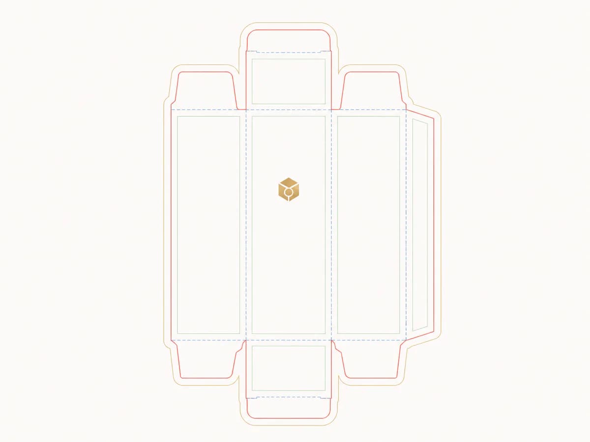
- Artwork is placed on the approved dieline at the correct scale
- Fonts are outlined or supplied according to the agreed file setup
- Linked images meet the confirmed resolution and color requirements
- Color references and spot-color names are clearly identified
- Foil, emboss, deboss and selective-effect layers are separated and named
- Bleed, safe areas, folds and seams have been reviewed
- A reference PDF shows intended appearance and finish placement
Frequently asked questions
Printing and finishing questions
How do I choose the right printing method for my packaging?
Start with the approved structure, material, artwork, expected quantity and visual priorities. PearlFold can then frame the printing directions that fit those inputs without treating one process as universally best.
Which finishes work on uncoated paperboard?
Compatibility depends on the specific stock, ink coverage, finish and production method. The combination should be reviewed against the selected paperboard and confirmed proof or sample.
Can multiple finishes be combined on one package?
They can be considered when each effect has a clear role and the production sequence supports it. A focused combination usually communicates hierarchy more clearly than applying every available effect.
How can a product range keep color and finishes consistent?
Use shared color references, repeatable artwork rules, controlled finish placement and approved production references. Variants can change while the underlying hierarchy remains recognizable.
Do you provide proofs or samples before production?
The appropriate review path depends on the project. Proof and sample expectations should be defined in the quotation and specification so the team knows which approval controls production.
Ready to plan your finishes?